Spider-Man movie suits compared: Raimi, Garfield and Holland
From Steve Ditko's purple and orange origins to the Stark suit, here is how the costume evolved through three film franchises
 GIQUE (AI-assisted)17 November 2026Editor: Digital Fox Talent Editorial TeamOn YouTube since 2020 · more than 25,000 subscribers

Spider-Man's suit has changed with every film franchise, but each version still pays homage to the original comic book design. The suits differ mainly in three details: the lenses, the spider emblem and the webbing. Here's how the look evolved from the comics through Sam Raimi's trilogy, The Amazing Spider-Man films and Tom Holland's run in the MCU.
Steve Ditko designed Spider-Man's classic comic book look
In the comics, Spider-Man wears a red and blue spandex suit. Black lines run along the red parts to look like webs, and a black spider emblem usually sits on the front. The design and shape of that spider can change depending on the version of the character.
The classic look debuted in Amazing Fantasy #15, and it was created by illustrator Steve Ditko. Stan Lee originally asked artist Jack Kirby to design the hero's look, but Kirby's drawings didn't quite match Lee's vision for the character. So we have Ditko to thank for the classic design. That doesn't mean Kirby didn't play a pivotal role in the final look.
A rumored Halloween catalog link to the Spider-Man costume
There have been rumors that the original Marvel design took inspiration from a Halloween catalog from Ben Cooper, a company well established for its Halloween novelties. In 1954, it released a catalog with a Spider-Man costume illustrated on the cover.
If you take a closer look at the mask, you can see how it resembles Marvel's design. Both masks have the black outline around the eyes, surrounded by lined web details. When asked about the comparison, though, Stan Lee said the costume reminded him more of the 1928 film The Spider. Ditko denied the comparisons altogether.
Spider-Man's suit was originally meant to be purple and orange
Anyone can recognize Spider-Man by the red and blue, but Ditko confirmed that red and blue were never part of the original design. In the 2007 BBC documentary In Search of Steve Ditko, he revealed that the original suit was meant to be purple and orange. Talk about a Halloween inspired look.
On the original colors, Ditko said: "I'm sure it would have been just as popular even if it didn't have the suit colors we were originally looking for." He added that he didn't know whether the orange and purple were discarded because they would have printed darker on the cheaper paper of the time, or because blue and red were seen as more flashy and Marvel didn't have a blue and red character yet.
Could you imagine our iconic web slinging hero rocking purple and orange? I don't think it would look half bad, but it's hard to picture Spider-Man any other way.
The Raimi Spider-Man suit set the blueprint with raised webbing
The Raimi suit has long been a favorite among Spider-Man fans. Whether you love it for nostalgia or design, there's no denying that the original movie suit does classic Spider-Man justice. In Spider-Man (2002), starring Tobey Maguire, the suit he would wear across all three films was adapted by costume designer James Acheson alongside special effects supervisor Tom Woodruff Jr.
Many design decisions depended not only on keeping the image of Spider-Man from the comics, but also on making the suit practical for Maguire and the stuntmen to wear. The suit is very similar to Amazing Fantasy #15, almost as if it was ripped right off the comic pages. What set it apart were its lenses, spider emblem and webbing, the same three details behind most of the prominent changes in later suits.
In an interview with ComicBookMovie.com, it was explained that the team worked for months creating the many forms of the suit. Much thought went into the shape of the head form, the physique beneath the suit, the eye shells, the webbing, the emblem and even how the suit would move. For the eye shells, they considered many variations, from comic book opaque that still allowed vision to translucent.
The most distinctive parts of the Raimi suit are probably the raised webbing and the spider emblem. Those details were hand cut and essentially added as another layer onto the suit. Accentuating them helped establish the Raimi suit as the blueprint moving forward.
The Amazing Spider-Man suit was built around technology
The Amazing Spider-Man reboot in 2012, starring Andrew Garfield, introduced a suit that looked very different from the original trilogy. It got a lot of backlash for its design. Its development clearly relied more on computer technology and printing than on handcrafting.
The film's costume designer said in an interview: "I began with the idea that Peter Parker creates the spider costume in his computer." The goal was an electronic world with evidence of technology everywhere, so the suit needed to become part of that world. In comparison, the Raimi suit depended more on comic accuracy and practicality, while The Amazing Spider-Man design was influenced by its surrounding environment.
The suit looks cutting edge and vibrant, with plenty of texture that makes it seem almost futuristic. The ratio of blue to red differs slightly from Raimi's, and the legs on the spider emblem are a bit longer. The eye shells hold a similar shape to the earlier suits, but with yellow tinted lenses.
This suit also builds web shooters into the design. The costume designer said they were modeled on wide leather watch bands with plastic covers that snap over the face, so Peter could disguise his web shooters as a watch if the situation called for it.
The Amazing Spider-Man 2 suit returned to the classic look
While the first Amazing Spider-Man suit established a new, alternate version on film, the Amazing Spider-Man 2 suit drew back toward the classic look of the Raimi films and Amazing Fantasy #15. Costume designer Deborah Lynn Scott was tasked with reinterpreting a comic book accurate version of the suit, using the same screen printing technology as the first film.
The major difference between the two suits is the lenses. The second suit went back to the white opaque lenses first seen in the Raimi trilogy, but with a larger eye shape that gives Spidey a bit more of a friendly appearance.
Tom Holland's Stark suit in the MCU
The MCU has given us several suits worn by Tom Holland as Peter Parker, about six versions in total. The one Peter spends the most time in is the Stark suit. It's featured in all of his MCU appearances prior to No Way Home, and even in Avengers: Endgame it acts as the base for his Iron Spider suit.
Louise Frogley is the costume designer behind Spider-Man: Homecoming. Like the suits before it, the Stark suit was created with Ditko's original design in mind, with the iconic blue and red fabric and a spider emblem. This emblem is the smallest we've seen on screen, but closer to the comic book version.
The suit adds details we hadn't seen before, such as black detailing around the torso, biceps and calves, plus Peter's web shooters. These are more prominent than Garfield's because they wrap around the wrist instead of being built into the suit.
What's cool about this suit is how much it has evolved technically. The Stark suit and many other MCU suits have features like moving lenses and a built-in AI system, thanks to Tony Stark. In comments to GamesRadar, it was explained that Sony allowed Marvel to take a Marvel approach to the webbing, which was more classic. The result is a classic suit with webbing much like the cover of Amazing Fantasy #15.
What other creators are saying
More on Spider-Man →I think the opening pits Tobey Maguire's Spider-Man and Doc Ock against the X-Men, likely triggered by a comics-style incursion forcing the X-Men to destroy his universe, with Doom later framing the X-Men as villains to manipulate the Avengers into war.
Avengers: Doomsday Opening Scene Reportedly Pits Tobey Maguire's Spider-Man Against the X-Men →
I believe Garfield and Maguire are guaranteed returns in Secret Wars (with Maguire likely also in Doomsday), since their No Way Home comebacks were a welcome back, not a goodbye, setting up a three-Spider-Man multiversal crossover split across teams alongside the Avengers and X-Men.
Andrew Garfield in Secret Wars: will he return as Spider-Man? →
I think the script's deja vu and faint recognition lines hint MJ could eventually break the spell and remember Peter herself, and that the final swing reads as freedom rather than pure tragedy.
Spider-Man: No Way Home: will MJ remember Peter on her own? →
I loved the Nightmare Cabin memories and think the final Essex and Sentinel battle, clearly indebted to Shadow of the Colossus, is the best fight in the game. I also believe the Gambit card hints at a possible future X-Men RPG, and the motorcycle sections deserve their own Road Rash mode.
Marvel's Wolverine Easter Eggs: Al Capone, Gambit, Dead Mutants and Spider-Man Links →
Watch the original
@gique_ · YouTube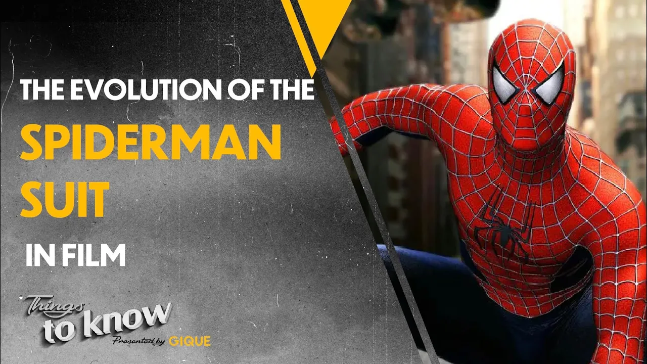
Adapted with AI from GIQUE's video of 21 October 2022 and checked against the video before publication. Editorial standards · Corrections
More from @gique_
All →


Make videos? Your next one could be an article here.
We turn your videos into articles under your name, linked back to the original. You keep 60% of what they earn, non-exclusive, and you can leave whenever you like.
Become a SubPlotter →